Creature Mark: Pelican
I was tasked with designing a simplified black and white animal form of my choosing. The goal of the project was to capture the animal’s signature characteristics and unique personality traits through design elements like point, line, and shape. After creating the creature mark, we were challenged to place it in a typographic composition that conforms to the Fibonacci Proportion.
Research
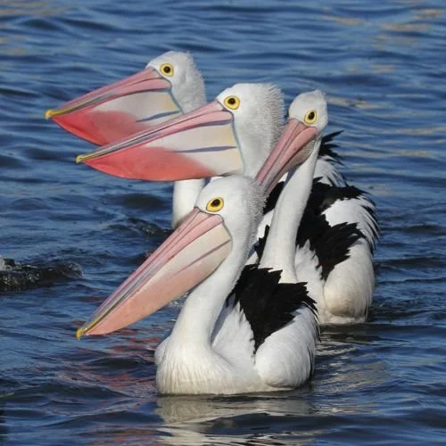
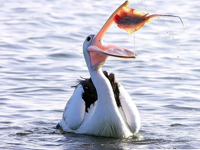
I started by finding photos of my chosen animal, the Australian Pelican. I loved the quirky elegance of the animal and the almost painterly stripes on their bills. Next, I did research on the pelican in order to make a list of their tangible and intangible traits.
Loud
Wide wings
Large beak
Predator
Hunter
Pouch
Long neck
Webbed feet
Heavy
Bulky
Strong
Glide
Flap
Soar
Skim
Snap
Encircle
Scoop
Plunge
Dive
Scavenger
Carnivore
Great eyesight
Good swimmer
Intangible
Indimidating
Social
Awkward
Clumsy
Magestic
Comical
Intelligent
Affectionate
Powerful
Docile
Final
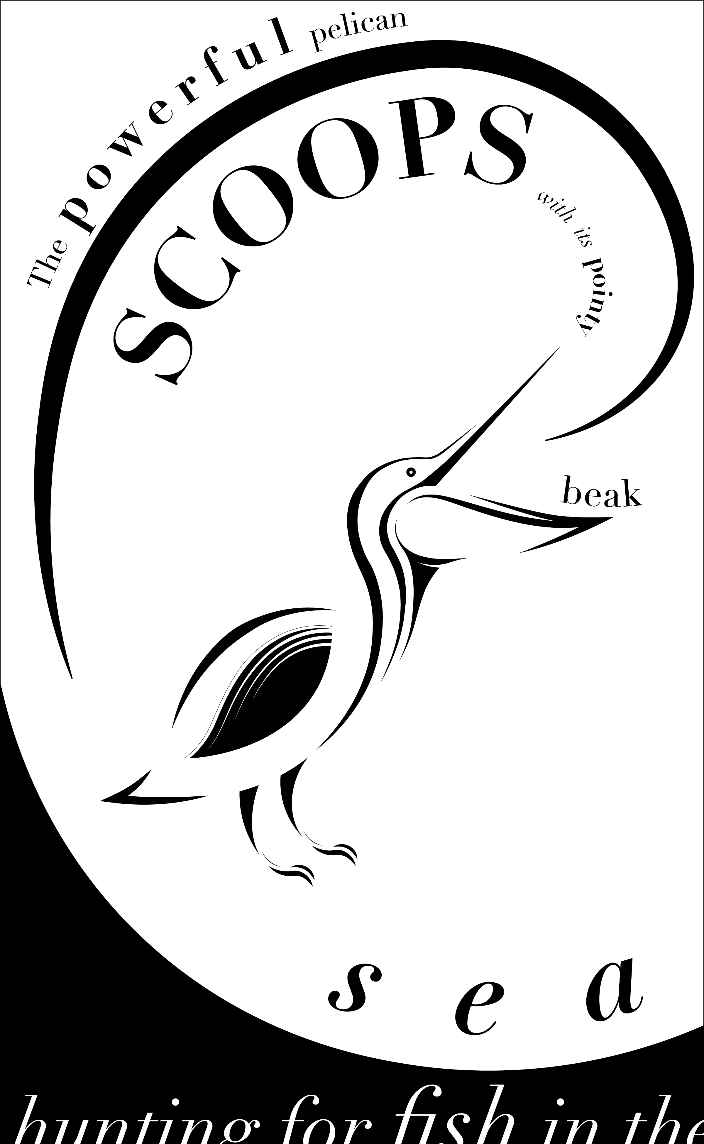
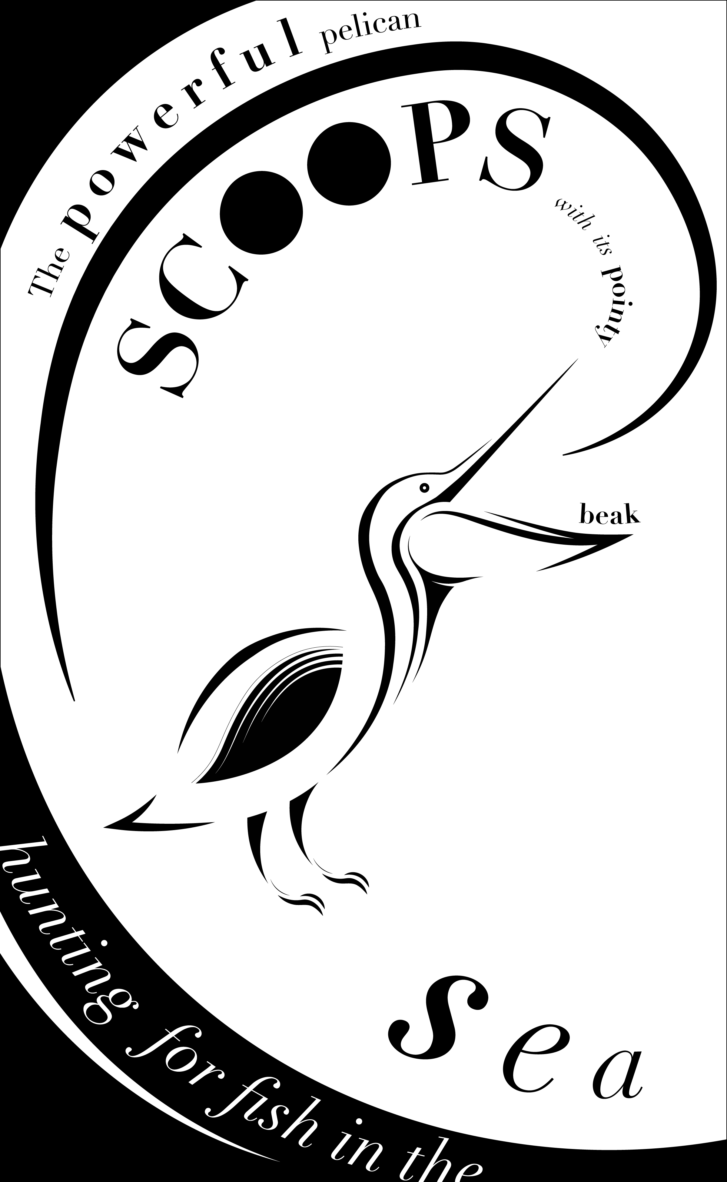
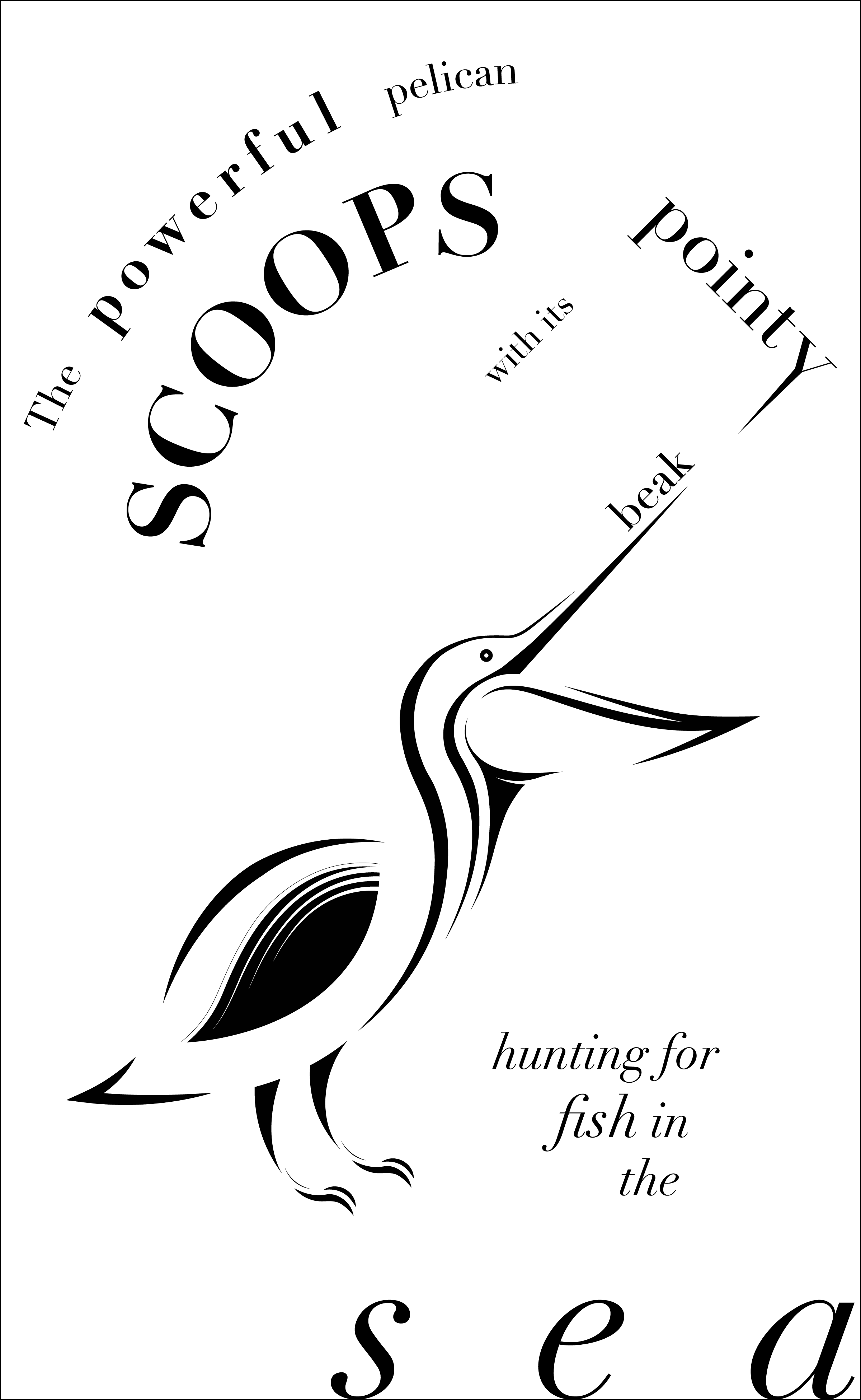
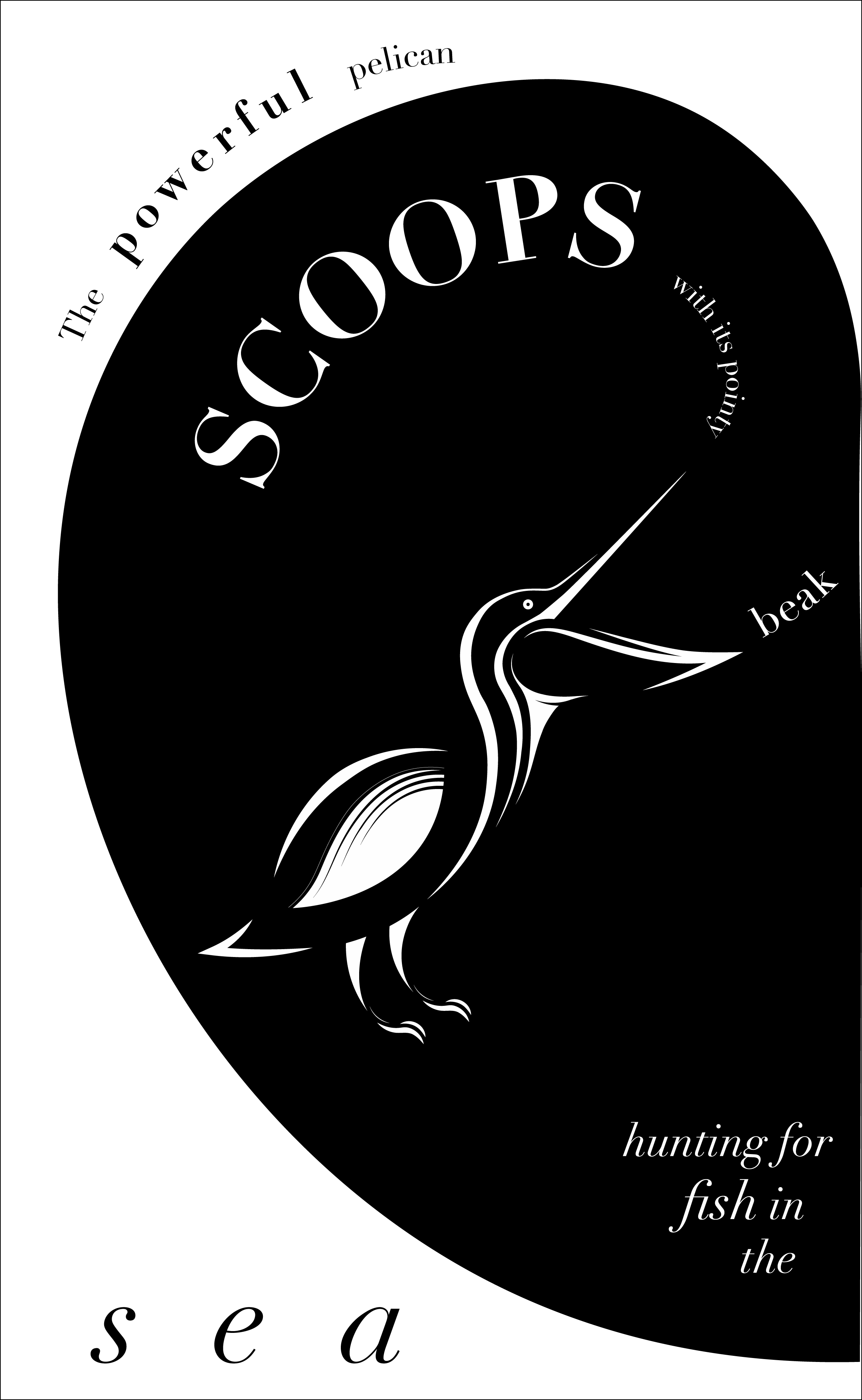
The final typographic composition is an abstract representation of sky and sea. This is demonstrated by the figure ground reversal that happens when the white type is placed on the black corner. Adding moments where the type is slightly cut off in this area adds to the suspense of the hunting and reinforces the tension between the sky and the sea.
Sketching
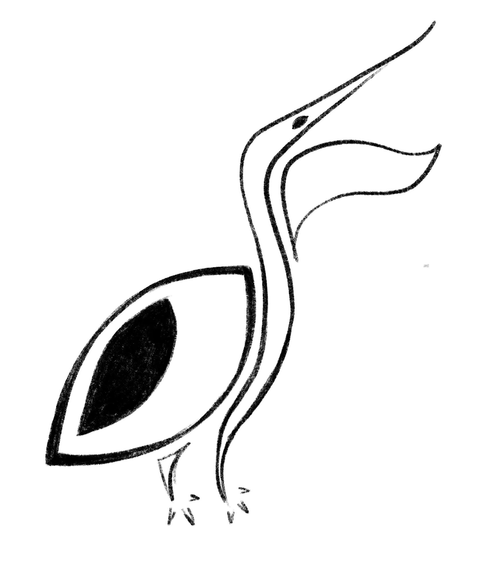
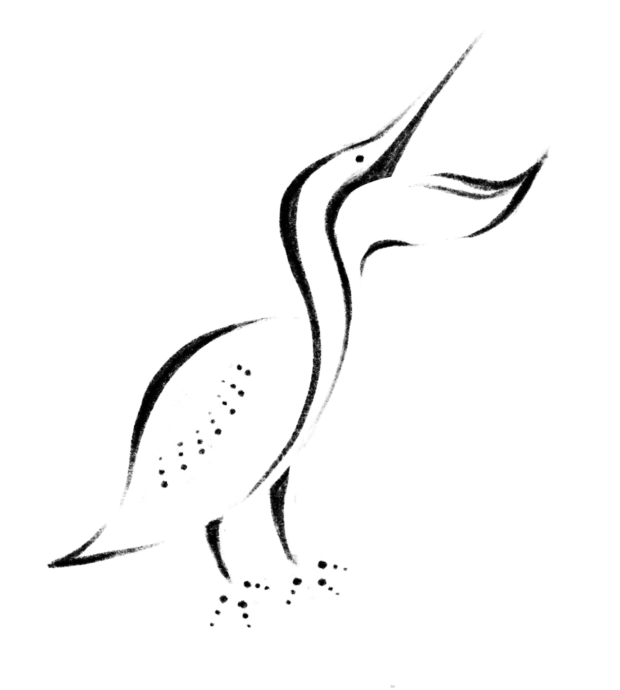
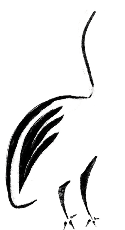
The main thing that I focused on while sketching was avoiding directly tracing the reference photos. I wanted to capture the pelican’s essence while still simplifying the form into shapes that repeat themselves throughout the composition.
Tangible
Digital Iterations
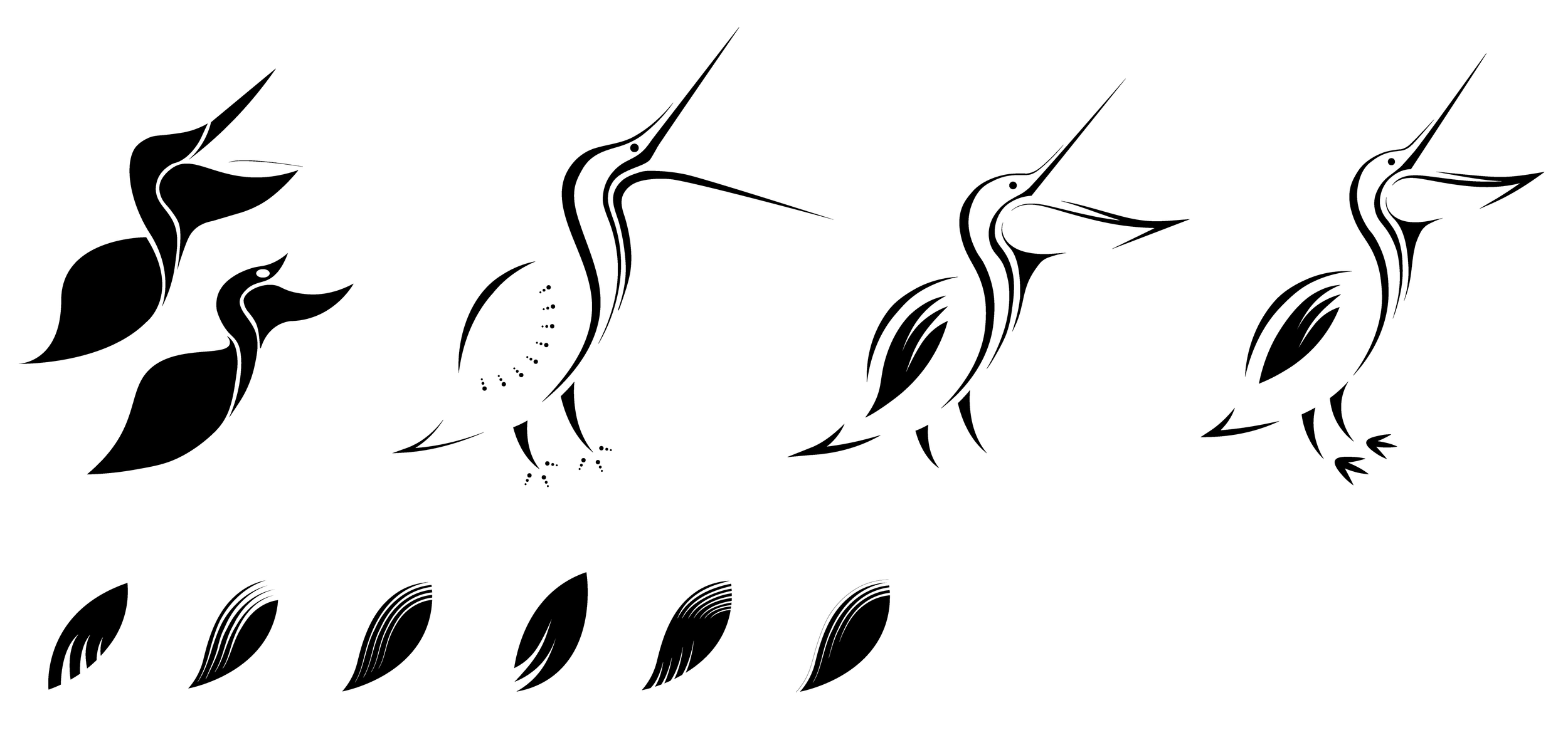
As I started to translate my ideas into Adobe Illustrator, I slowly progressed from representing the pelican with literal, solid shapes to implied strokes. My professor challenged me to remove unnecessary elements that the viewer can imply on their own.
Final
Overall, I wanted the pelican to have a consistent appearance in terms of pointy strokes of varying thicknesses, open white space, and the angle of the bird. The minute details like the white dot in the eye, the slice under the beak, and the thin curve above the feet bring elegance and help to balance out the quirkiness of the animal.
Typographic Composition Experiments
This phase of the project pushed me to be more experimental with type, specifically by using the formatting of the type to communicate a message. The message that I wanted to portray was the powerful swooping motion that the pelican makes when it hunts. The composition is meant to reflect the Fibonacci Proportion because the eye follows the curve to the focal point - the open bill.
Fonts: Didot LT Pro Roman, Bold, Italic, Bold Italic


