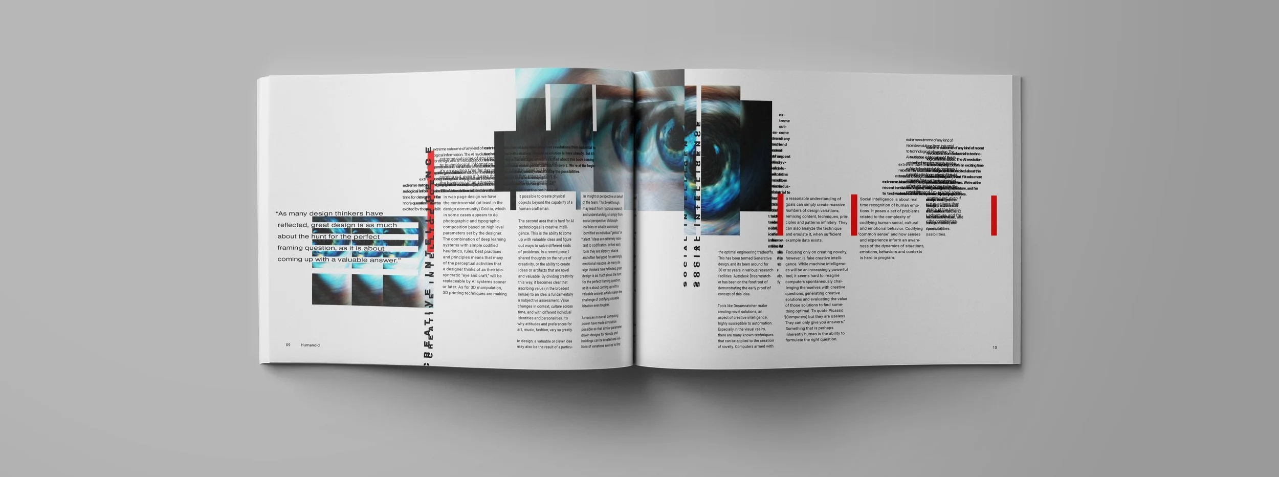
Humanoid is a science and technology magazine publication that focuses on the impact that artificial intelligence has on design. Its main audience is designers, so that they might stay well-versed in the world of AI and its impact on their creativity.
Magazine Identity: Humanoid
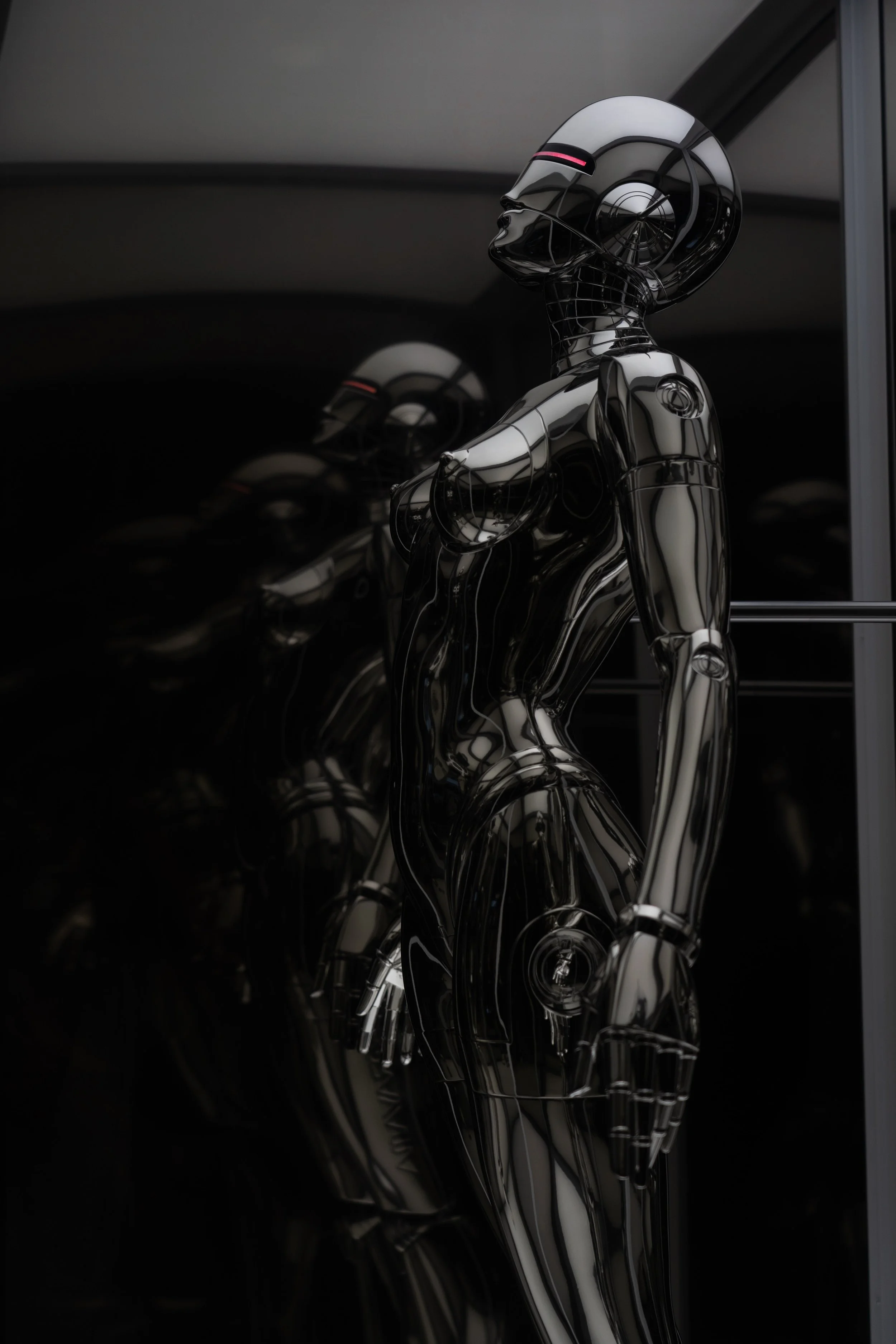
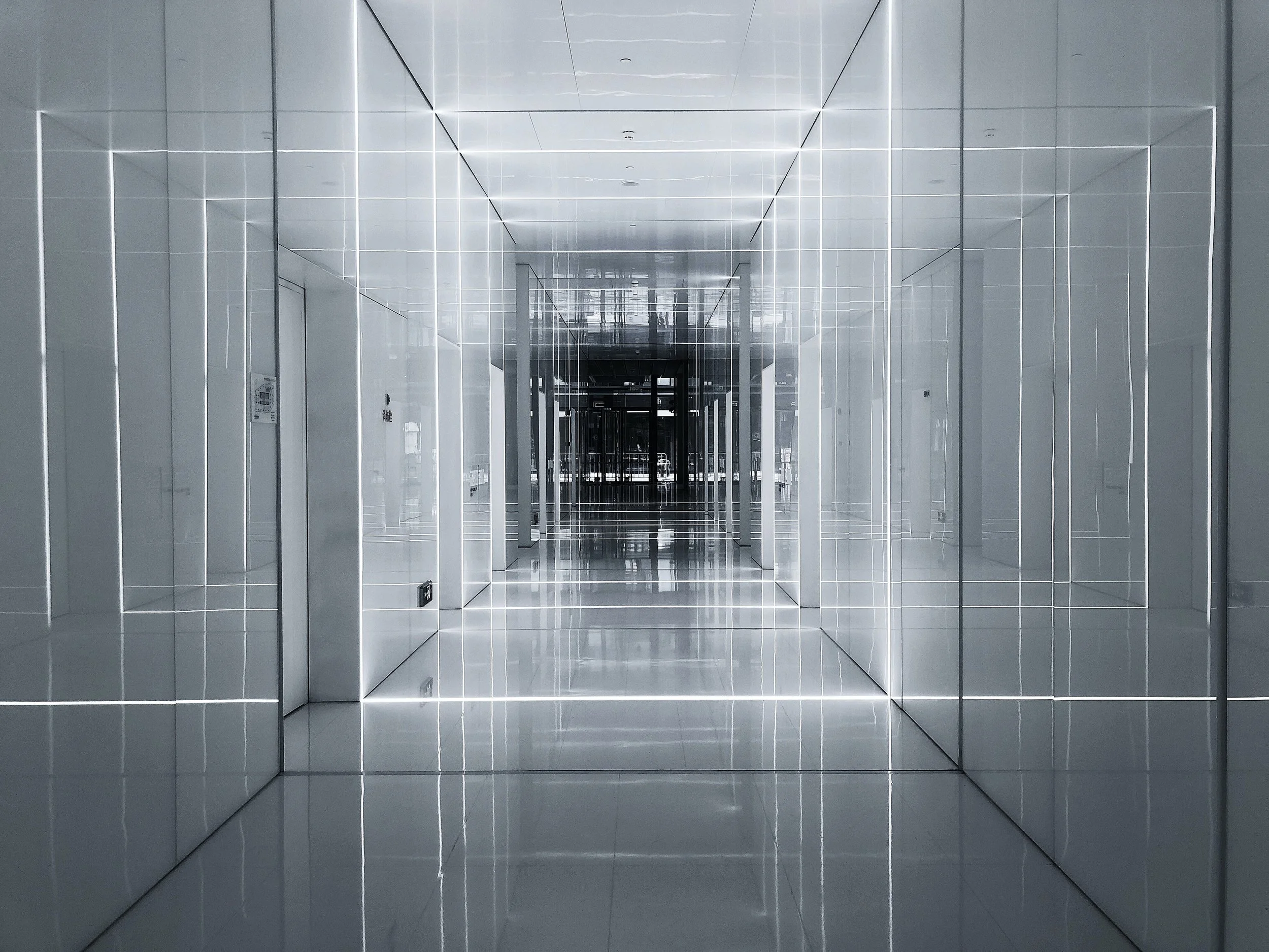
I began by coming up with words that Humanoid ought to reflect as well as captivating imagery that suited these descriptive words.
Concept Ideation
Futuristic
Robotic
Edgy
Fascinating
Zealous
Innovative
Ambitious
Adventurous
Galvanizing
Mysterious
Bold
These are some of the canned typefaces that I selected with the intention of making alterations to help suit the characteristics above.
Canned Typefaces
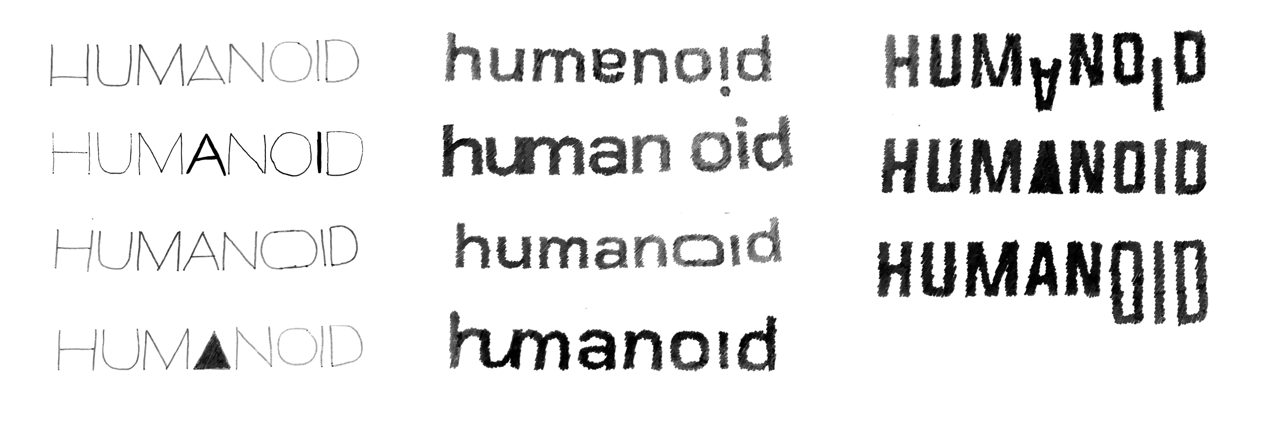
Sketching
In Illustrator, I experimented with ways to add to or take away elements of my chosen fonts to better fit my concept. The point of this process was to maintain a consistent typographic system between the letterforms so that they feel cohesive.
Digital Iterations
Final
Process GIF
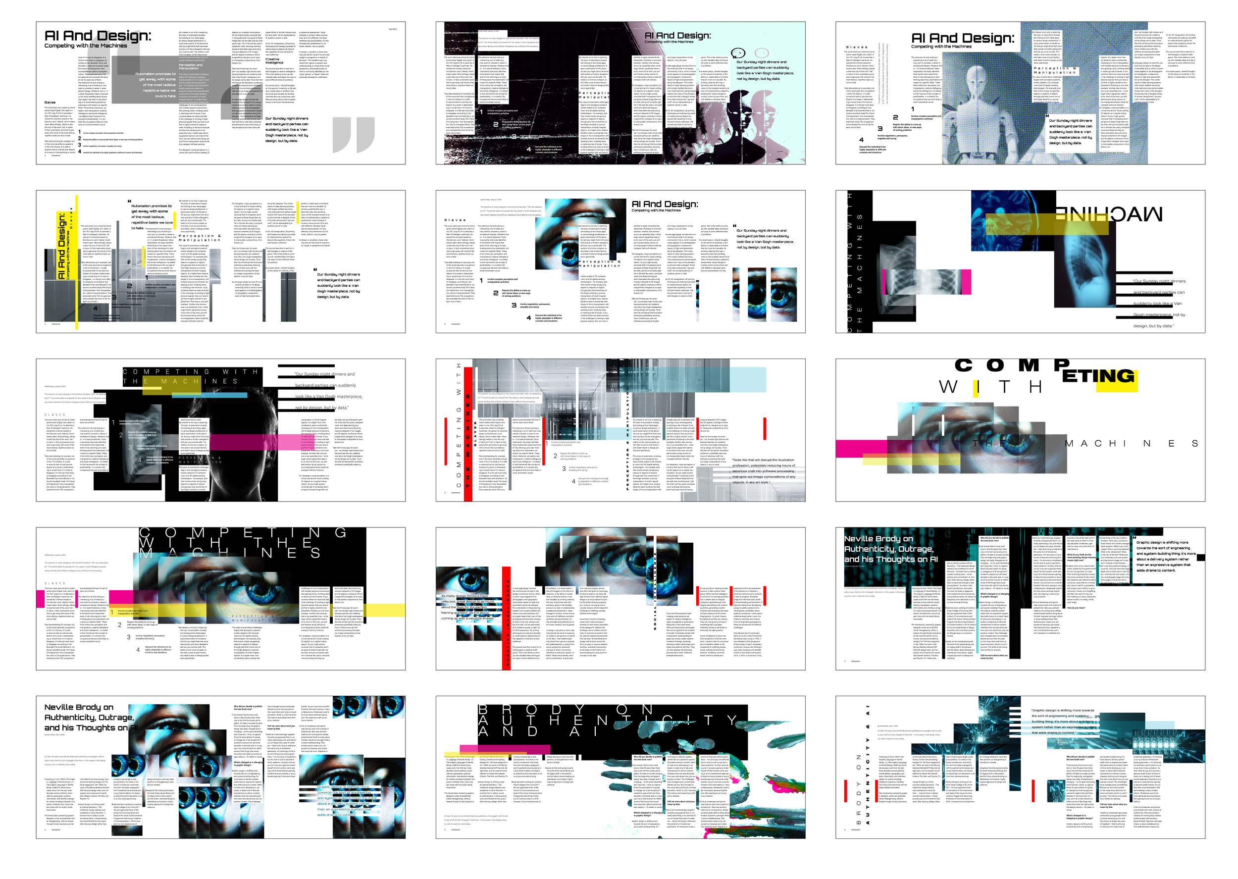
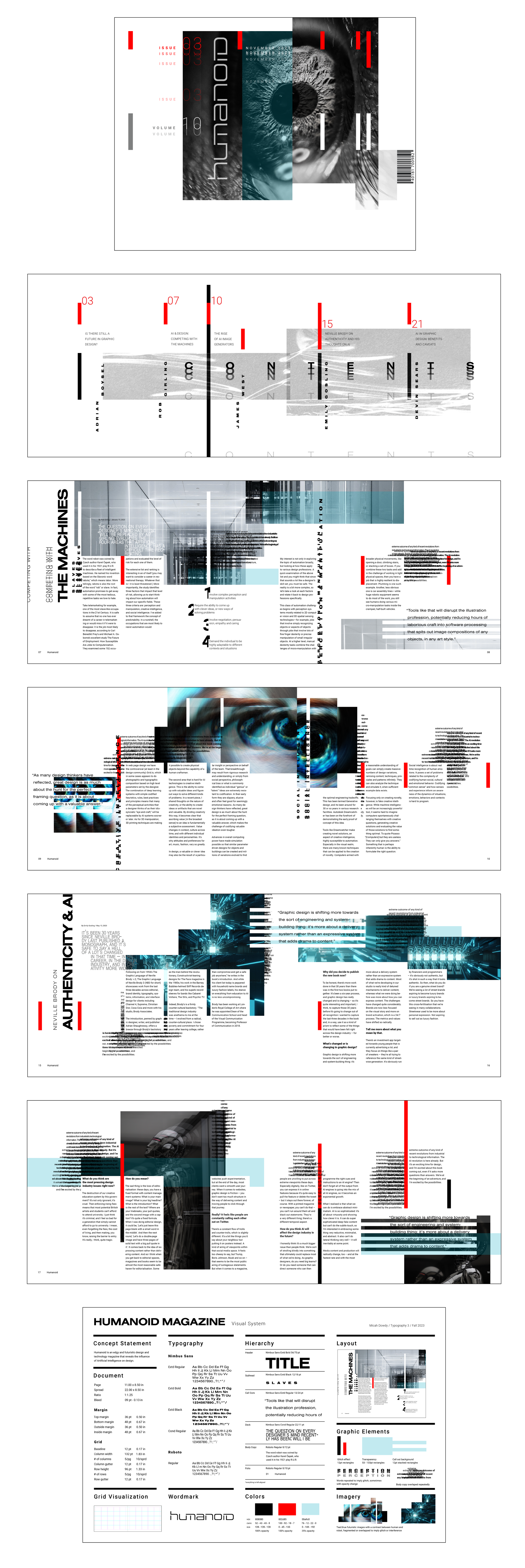
The concept that inspired the design of the magazine was “interference.” This inspired the methods that I used such as incorporating a glitch effect, fragmenting images, and repeating text. I wanted the magazine to feel a little unsettling, so I used “human” imagery like eyes but in a very stiff, robotic way.

